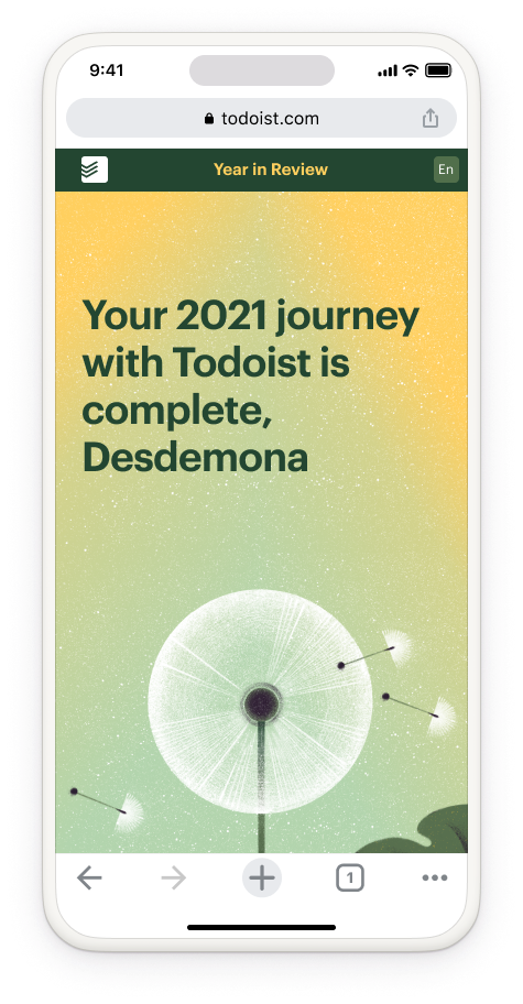
The report comes as a custom-built web page populated with live user data.
Traditionally, for productivity apps like Todoist, the more you do, the more "productive" you are, the better. But we wanted to take a more balanced approach focusing less on output and making the report feel like an encouraging friend supporting our users along their journey.
After exploring a few ideas, I landed on the concept of planting the seeds of future growth. Not everything we try will land and not every task we set out to accomplish will be successful. But we try anyway, and maybe something (a new habit, a new project) lands in the right spot, takes root, and flourishes.
I chose a horizontal scroll to surprise the users and reinforce the story dynamic of seeds moving along.
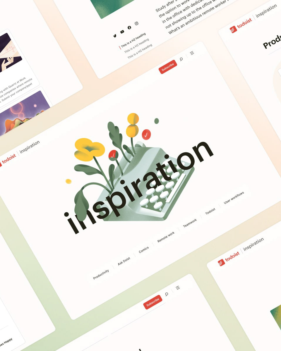
I worked with our extremely talented in-house illustrator to create the illustrations. Then our in-house motion designer brought them to life, emphasizing the forward motion.
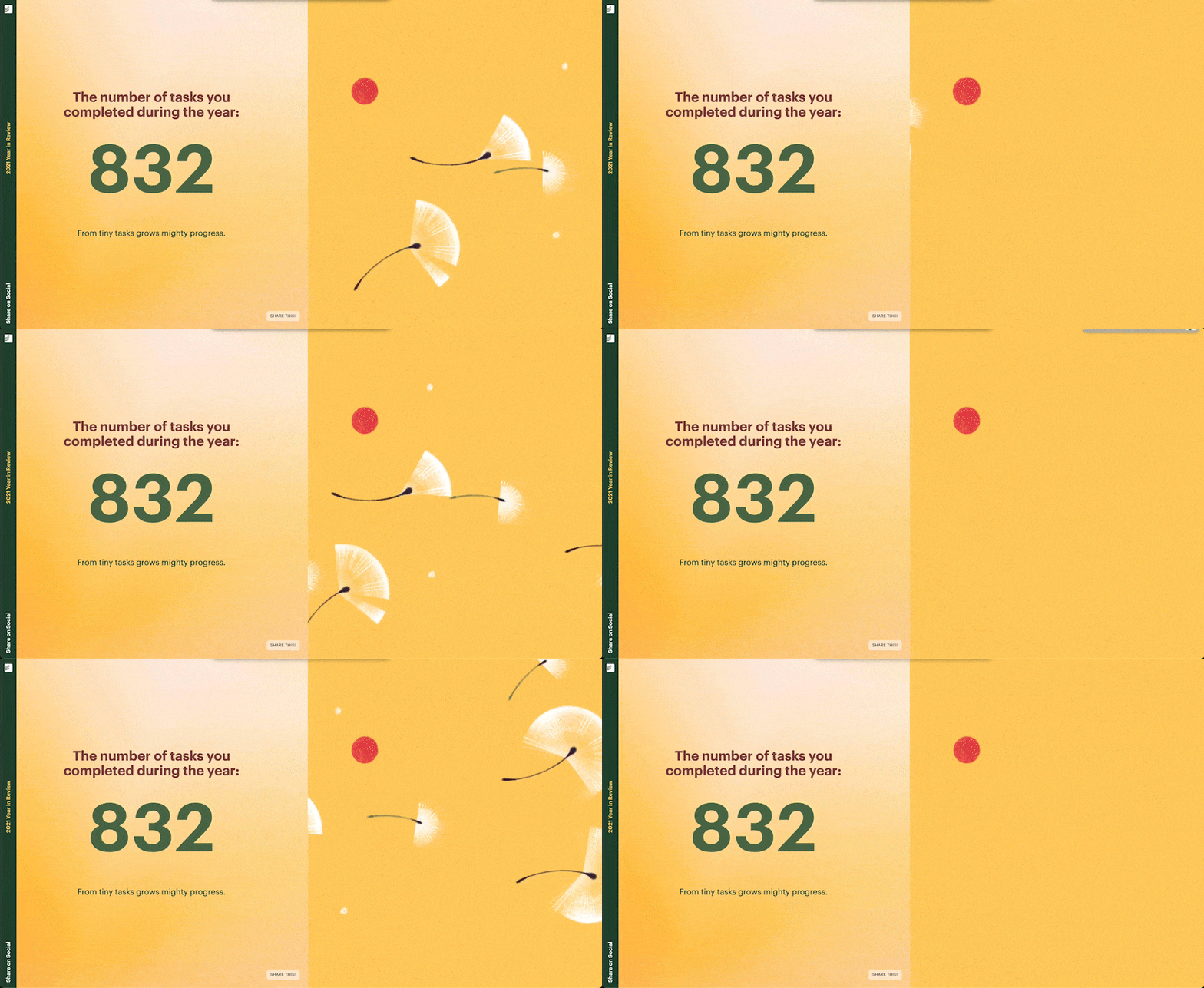
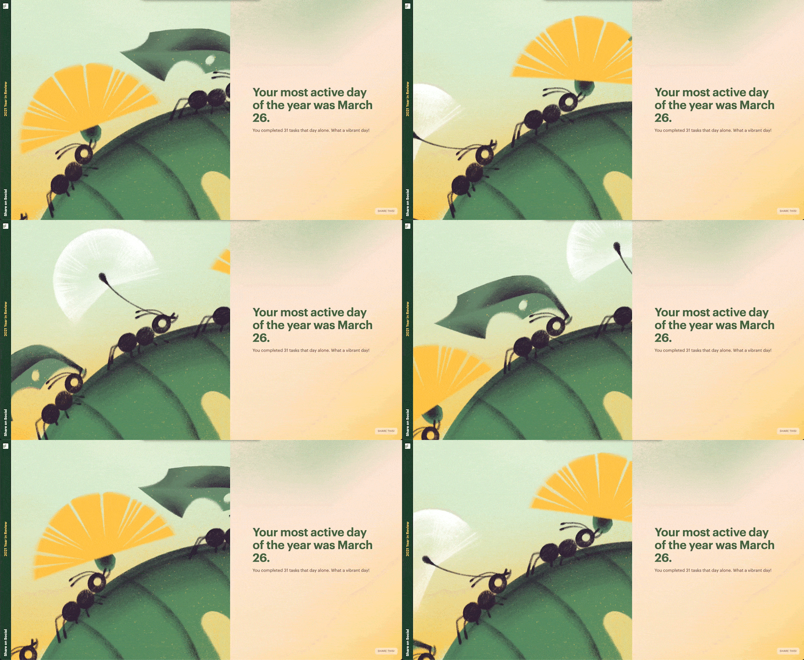
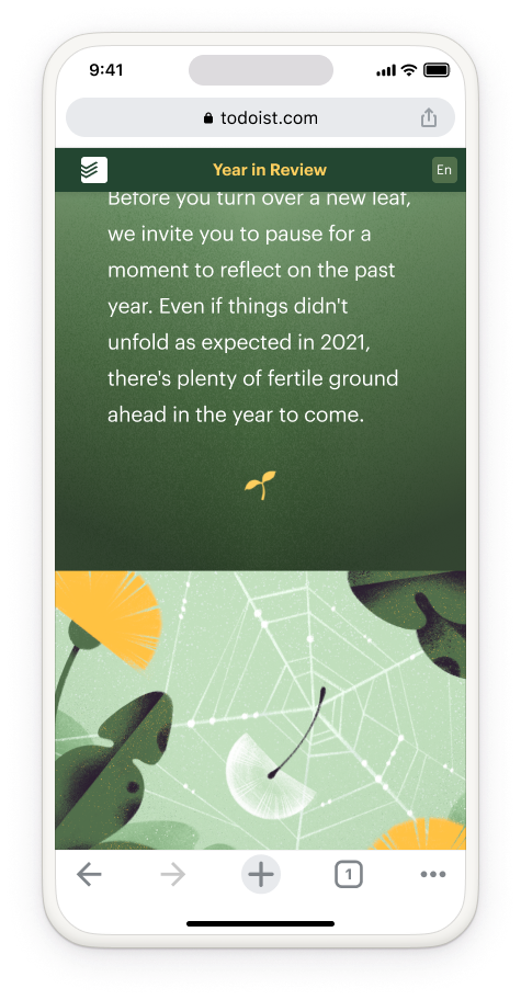
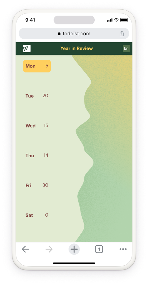
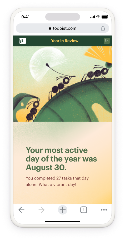
On mobile, the layout switches back to a vertical scroll better suited to the format.
Because the illustrations were so inspiring, I had the idea of using them for a calendar that we gifted to our employees for Christmas. It was a big success, but also a logistical nightmare given that our employees worked remotely from all around the world!
Art Direction: Anaïs Mares | Designer: Anaïs Mares
Illustrator: Margarida Mouta | Motion designer: Heather Andrews
Work done while working at Doist.
Illustrator: Margarida Mouta | Motion designer: Heather Andrews
Work done while working at Doist.
